OUR STORY
Our brand mark icon represents Kount’s origins as experts in digital trust and safety. Our icon has been updated to assume the form of a hexagon, a common shape that is commonly found in molecular structures. A molecule, or “the smallest unit of a substance that still retains the properties of that substance”, is mirrored in today’s digital world as “data points”.
Kount’s chevron serves as the bond between verified data points, together forming a unique ID signature backed with data that our customers can trust.
DESIGN
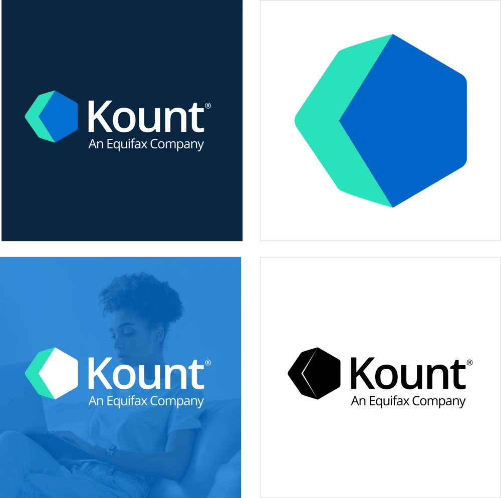
The Kount logo is comprised of two elements: the Kount icon and Kount wordmark. Together, these elements signify our expertise in trust and safety. Because the logo captures the essence of our end-to-end expertise, consistent use and application can increase the value of our brand over time. The two elements of our logo come together in the following way: The icon is a simplified representation of the legacy “K for Kount” chevron and a rotation of the legacy pentagon that come together at the edges to form the three-dimensional shape. The Kount wordmark is straightforward, bold and set in Open Sans.
When the logo is placed over a busy background, photo, secondary color, or gradient, a white logo should be used. In some strategic instances, a solid black logo may be used.
Consistent presentation is an important part of making the Kount logo recognizable. The following examples highlight proper uses:
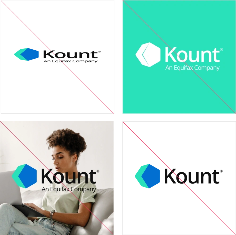
Consistent presentation is an important part of making the Kount logo recognizable. The following examples highlight a few improper uses:
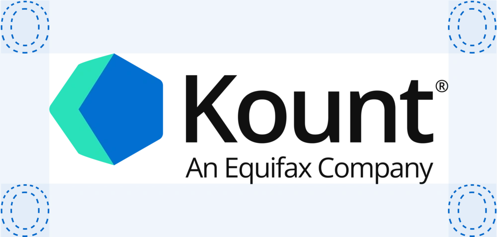
The Kount logo needs room to breathe. There should be a minimum buffer equal to the size of the lowercase “o” in the wordmark.
DESIGN
Color plays an important role in our brand identity ecosystem. Our primary colors symbolize innovation, stability, expertise, and trust. The Kount logo and brand consist of a blue color palette and plays a vital role in our brand communications.
Trust Teal
Hex #2AE0BB
R42 G244 B187
C77 M0 Y46 K0
PMS 2239XGC
Dark Navy
Hex #0A2540
R10 G37 B64
C98 M82 Y46 K50
PMS 7463XGC
Safety Blue
Hex #0164CA
R1 G100 B202
C79 M40 Y0 K21
PMS 2935C
Neutral 1
Hex #F6F9FC
R246 G249 B252
C2 M1 Y0 K1
PMS 115-1C
Neutral 2
Hex #F2F1F2
R242 G241 B242
C0 M0 Y0 K5
PMS 179-1C
White
Hex #FFFFFF
R42 G244 B187
C0 M0 Y0 K0
PMS 1-1C
Our secondary color palette represents Kount’s fresh and friendly energy. These colors are to be used strategically as accents or themes and never take precedence over primary colors.
Pineapple
Hex #FFD60A
R255 G214 B10
C0 M16 Y96 K0
PMS Yellow 012C
Orange Peel
Hex #FE9A21
R254 G154 B33
C0 M39 Y87 K0
PMS 1495XGC
Boise Blue
Hex #48ACF0
R72 G172 B240
C72 M9 Y0 K0
PMS 638C
Midigator Green
Hex #AFD25C
R175 G210 B92
C36 M0 Y82 K0
PMS 367C
Orchid Purple
Hex #9046CF
R144 G70 B207
C25 M54 Y0 K19
PMS 7442C
Warning Red
Hex #EF233C
R239 G35 B60
C0 M80 Y70 K6
PMS 52-8C
Legacy Kount Orange
Hex #F46036
R244 G96 B54
C0 M58 Y75 K4
PMS 811C
Ruby Red
Hex #E63462
R230 G52 B98
C0 M70 Y52 K10
PMS 62-7C
DESIGN
Our brand identity revolves around a consistent approach to use of typography. We use typography that is clean, modern, and timeless. Kount’s sans-serif font communicates contemporary and forward-thinking ideals while remaining fundamentally true to ageless and world-recognizable characters.
Keeping typography consistent and sticking to logical hierarchies ensures that elements in Kount are clear and easily recognizable when scanning the page.
We use only Open Sans for all text on web, print, and digital products.
DESIGN
Our iconography was designed to mirror the official Kount icon. We’ve used bold, solid shapes in our Safety Blue and Trust Teal to create consistency across the brand. Icons are intended to create compelling visuals for smaller sections of text, and should never be displayed with a width that is larger than 200 pixels. Where our Safety Blue and Trust Teal intersect in each icon, Neutral Dark Navy Blue should be used to illustrate overlapping elements.
DESIGN
Our brand photography selections should give off a natural, crisp air of satisfaction. These images should mirror the friendly, professional, and informal environment we work in. Imagery for social media should match our brand voice and have natural lighting.
People in photos should be wearing neutral colors or shades similar to our brand colors.


